|
Case Study View .pdf View Slides
|
|
Getting StartedIdentify the problem
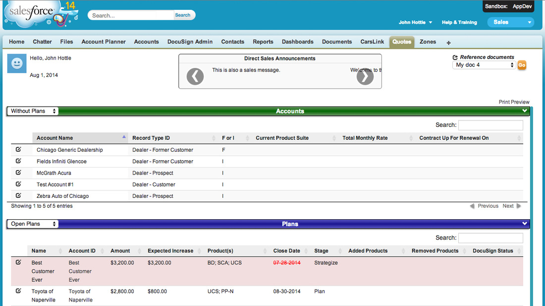
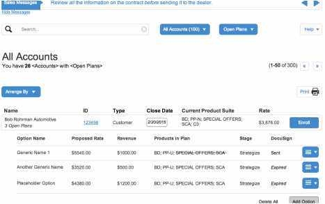
All Account Managers were given an iPad to use in the field, but were all-too-often requesting support for how to use the tool. Why did they need so much help? An Instruction Manual was created to use it. Content Audit If you want to fix a car, you need to know the parts and how they work. Before we stripped this interface down to nothing, we needed to first document all of the data points and flag key pieces of functionality. This was also a time to document any questions and assumptions regarding the data available. |
Learn the Processes of the Users
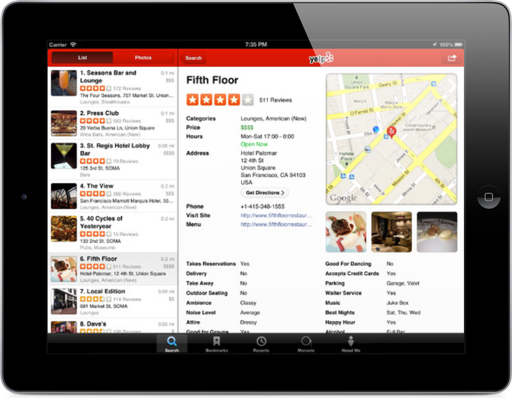
As part of the content audit, we uncovered that all Account Managers were at one time issued company iPads for use in the field. The interface, however, was designed for desktop and lacked ergonomic touch targets, readability, ease of use, and was overall too cumbersome of a tool to use effectively on an iPad.
Through interviews and contextual inquiries, we learned the users were creating multiple plans on their desktop or laptop machines at home to avoid the need to use the tool on-site.
In addition to this, we uncovered several shortcuts users were taking to help manage the headaches of Account Planner.
Identify Hangups and Issues of the Users
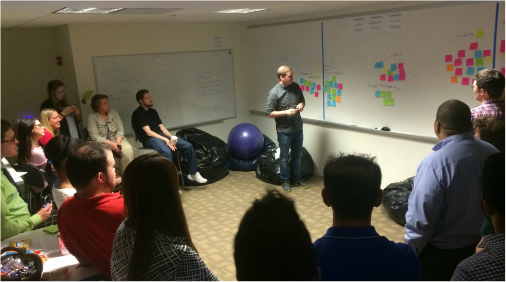
Heuristic reviews, contextual inquiries, interviews, usability testing – these are excellent methods to harvest feedback. There are never too many questions, and patterns will start to emerge. The key here is to focus on the major issues and avoid the outliers and edge cases. In this case, the primary issue was lack of usability on touch devices and information overload.

|
Personas
Because the tool being built was an internal tool, personas were fairly easy to build. We took a look at the makeup of our account managers who use Account Planner and determined there were for basic categories of users: Veteran field, veteran inside, new (2 years or less) field, new inside. There are other factors that we applied as well, including client geography (factoring cellular network speeds), and experience using tablet and mobile devices. Simplify the Process A closer look at the user behaviors and the data they consumer revealed a dire need for simplicity. By highlighting the primary content and hiding unnecessary data, we modified user flows to focus on the 5 primary areas of focus. All other content would still be accessible, but mitigating visual noise and ambiguity of actions was paramount to process improvement. |
|
Identify Inspiration: intuitive, influential interfaces
A closer look at the user behaviors and the data they consumer revealed a dire need for simplicity. By highlighting the primary content and hiding unnecessary data, we modified user flows to focus on the 5 primary areas of focus. All other content would still be accessible, but mitigating visual noise and ambiguity of actions was paramount to process improvement |
|
Conceptualization
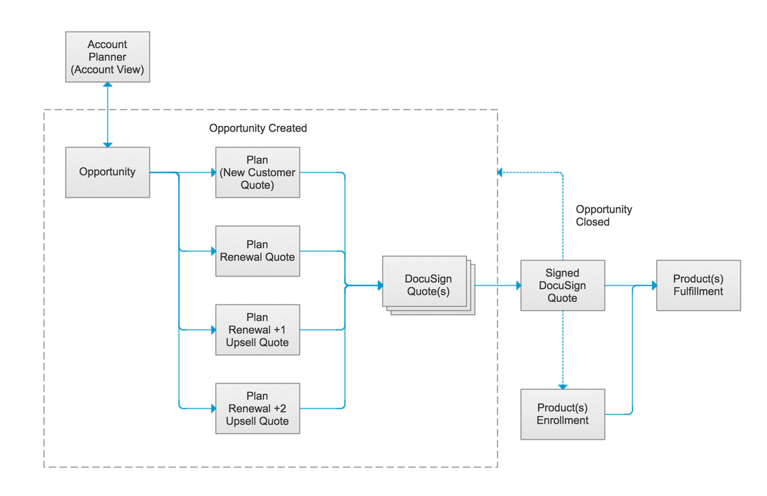
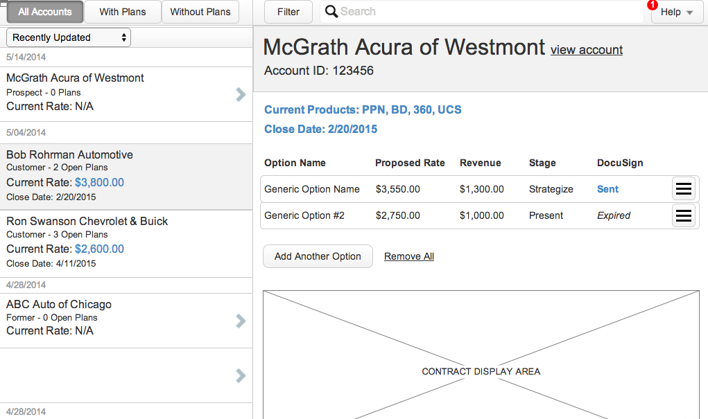
Taking into account requirements from upstream stakeholders, we started working through wireframes.
The key guidelines in terms of UX were to accommodate the current user flow, mitigate change management, optimizes the ideal process for end users, and ensure it is easily learnable, intuitive, and designed for a touch interface (primarily iPad).
|
|

|
Usability Testing
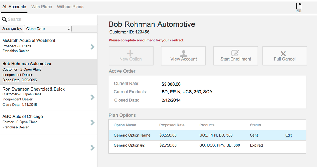
During each iteration of concepts, we tested the responsiveness and interactions, and also tested usage with real users. We gathered feedback, and made updates accordingly. Once the go-live date was imminent, we stopped changes, moved the prototype into a testing environment for QA, and prepared for the initial release. Read the test document. Release & Iterate After releasing the product, user feedback is even more critical, and updates continued to the interface to improve the user experience, and ultimately company performance. Account Planner was used to generate ~$100 million in revenue in its first year after the update, and electronic contracts succeeded 95% adoption. |
The Results
Over 400 individuals use account Planner on a regular basis.
Since completion of the first release, AP has been used to generate ~$100 million in revenue in its first year after the update, and electronic contracts succeeded 95% adoption.
The project has received significant;y greater positive feedback from both users and stakeholders.
Because of the responsive nature of the design, Account Planner is enabled for the Salesforce mobile app. While that was never the intention and wasn’t necessarily in-scope, a mobile-first design philosophy future-proofed the solution.
Lessons Learned
Early pushback made content reduction challenging. A presentation to the stakeholders to showcase information overload and the impacts on task completion would have been beneficial to sway closed minds.
There was also pushback on user testing, since this product is in-house. Documenting user struggles, unnecessary information, and actual user processes (as opposed to ideal approach) will hopefully add value to future efforts for this team.
Having only one designer on the team made things complex. Before sharing any concepts with others, I had to first explain the business processes and the product ecosystem. It was challenging to bounce ideas off of designers without them being privy to the complex nature of the flows.